How and Why to Present Data?
Data Presentation forms an integral part of all academic studies, commercial, industrial and marketing activities as well as professional practices. Presentation requires skills and understanding of data. It is necessary to make use of collected data which is considered to be raw data. It must be processed to be used for any application. Data analysis helps in the interpretation of data and help take a decision or answer the research question. This can be done by using various Data processing tools and Softwares. Analysis starts with the collection, followed by processing. This processing can be done by various data processing methods. Processed data helps in obtaining information from it, as the raw form is non-comprehensive in nature. Presenting the data includes the pictorial representation by using graphs, charts, maps and other methods. These methods help in adding the visual aspect which makes it much more comfortable and easy to understand. This visual representation is also as called as data visualization. Representation is depend on the available data point, data set, format, file format, available tools etc.
Types of data which require presentation – Text, Number Table & Graphs
The data you wish to present is available in various files and formats. It can be in a human readable form or needs to be processed. With the advancement and improvement in technology, various new types of format have emerged. These new format help in capturing, storing and understanding more aspects of any study. Widely used form of data are mentioned below:
- Textual – Raw data with proper formatting, categorisation, indentation is most extensively used and is a very effective way of presenting data. Text format is widely found in books, reports, research papers and in this article itself.
- Numerical – Data in the form of digits or numerical form have a significant value. It is often combined with text form to be put to use but it has meaning and value of it’s own as well. Numbers also form the basics of computers and the binary language, thus can be used in a variety of ways.
- Image or Pictorial – Image can be considered as another form of data since it can also be processed. Depending on the imagery it can be used either as raw data or processed data.
- Locational or Spatial – Spatial data is based on location. It is used to store the geographical location of a place, event, monument or any other thing to which location can be attributed.
- Maps – Various types of maps are available and used all over the world. Maps are now not restricted to showing geographical boundaries and hold much more value now. They help in presentation data such as topography, pollution levels, heat, demographic data, thematic as well as temporal changes.
- Other Types – Apart from the types mentioned above, there are several other forms as well which are independent type or a combination of such types of data. These can be in for of signals, special codes, encrypted data, symbols, markings etc.
The Significance and Importance
An excellent presentation can be a deal maker or deal breaker. Some people make an incredibly useful presentation with the same set of facts and figures which are available with others. At times people work really hard but fail to present it properly and have lost essential deals. The work which they did was unable to impress the decision makers. So to get the job done, especially while dealing with clients or higher authorities, No one is willing to spend hours in understanding what you have to show and this is precisely why it matters!
Related: Data Visualization, Data processing cycle, Qualitative Data
Factors which directly affects the data presentation
Some of the factors which directly affects the data presentation include data quality, correlation coefficient, vector images, colour scheme etc. When dealing with large amount of data, it needs to be carefully analysed and filtered. An understanding of sampling and sample size is essential.
Data analysis helps people in content analysis and understanding the results of surveys conducted, makes use of already existing studies to obtain new results. Helps to validate the existing research or to add/expand the current research. Graphical form is the most widely used method. The input for such graphical data can be another type of data itself or some raw data. For example, a bar graph & pie chart takes tabular data as input. The tabular data in such case is processed data itself but provides limited use. Converting such data or raw data into graphical form directly makes it quicker and easier to interpret.
Another method is Tabular form. It is generally used to differentiate, categorise, relate different datasets. It can be a simple pros & cons table, or corresponding value such as annual GDP, a bank statement, monthly expenditure etc. Quantitative data usually require such tabular form.
Data Presentation and Analysis or Data Analysis and Presentation?
These two go hand in hand, and it will be difficult to provide a complete differentiation between the two. Adding visual aspect or sorting it using grouping and presenting it in the form of table is a part of the presentation. Doing this further helps in analysing data. During a study with an aim and multiple objectives, analysis will be required to complete the required objectives. Compiling or presenting the analysed data will help in overall analysis and concluding the study.
You can have a variety of data which can be used in presentations. Some of these chart types include :
- Time Series
- Bar Charts
- Combo Charts
- Pie Charts
- Tables
- Geo Map
- Scorecard
- Scatter Charts
- Bullet Charts
- Area Chart
- Text & Images
Choosing the right method such as use of pie chart, tabular form, line graph, histograms, regression line etc is vital. When dealing with charts and graphs, having sufficient knowledge about frequency distribution, regular interval, axis label, frequency and other such terms is important. Some of these have been described in brief with an example at the end of this article.
Steps for Presenting and Analysing Data:
- Frame the objectives of the study and make a list of data to be collected and its format.
- Collect/obtain data from primary or secondary sources.
- Change the format of data i.e., table, maps, graphs, etc. in the desired format.
- Sort data through grouping, discarding the extra data and deciding the required form to make data comprehensible.
- Make charts and graphs to help to add visual part and analyse trends.
- Analyse trends and relate the information to fulfil the objectives.
Other points to remember
- A presentation should have a predefined sequence of arguments being made to support the study. Start with stating the Aim of study and the objectives required to reach the aim.
- Break the objectives in multiple parts and make a list of data to be collected. Noting down the sources of data, form in which data exist and needs to be obtained. Also conducting a primary survey for information which does not exist.
- Form and explain the methodology adapted to carry out a study.
- Data collection through primary survey needs to have well thought of sampling methods. This will help in reducing the efforts and increasing efficiency. Sample size should be given importance and correct sampling technique should be applied.
- Present only the required information and skip the background research to make your point more clear.
- Do not forget to give credits and references in the end and where ever required.
The presentation can be done using software such as Microsoft Power Point, Prezi, Google Analytics and other analytic software. It can also be done by making models, presenting on paper or sheets, on maps or by use of boards. The methods selected depends on the requirement and the resources available.
Related: Data Mining, Data Mapping, Cluster Analysis, Qualitative Research, Quantitative Research
How to present the different type of data – which format to choose?
Since there are number of options available while presenting data, careful consideration should be given to the method being used. A basic understanding of the desired result/ form is helpful to choose the correct form of representation. One cannot expect to get liner data from a pie chart, thus basic knowledge and application of different type of presentation methods saves time. Additionally, there should be enough sample available so as to get some meaningful analysis and result. Some of the popular ways of presenting the data includes Line graph, column chart, box pot, vertical bar, scatter plot. These and other types are explain below with brief information about their application.
Secondary surveys form a significant part of research and primary means of data collection by conducting various studies and making use of existing info from multiple sources. The data thus obtained from multiple sources like Census department, Economics and Statistics Department, Election Commission, Water Board, Municipal Bodies, Economic surveys, Website feedbacks, Scientific research, etc. is compiled and analyzed. It is also required to forecast and estimate the change in the requirement of various resources and thus provide them accordingly. Phasing and prioritization form another important part for the effective implementation of the proposals.
Such presentation and information can be either by means of manual hand drawings/ graphs & tables, Whereas much effective and accurate way for such presentation is by means of specialised computer softwares.
Examples and chart types for data presentation
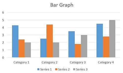
Bar Charts/Bar Graphs: These are one of the most widely used charts for showing the grown of a company over a period. There are multiple options available like stacked bar graphs and the option of displaying a change in numerous entities. These look as shown in the image below:
Related: Methods of data collection, Data Processing
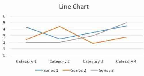
Line Chart: These are best for showing the change in population, i.e., for showing the trends. These also work well for explaining the growth of multiple areas at the same time.
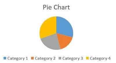
Pie Charts: These work best for representing the share of different components from a total 100%. For, eg. contribution of different sectors to GDP, the population of different states in a country, etc.
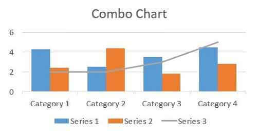
Combo Chart: As the name suggests it is a combination of more than one chart type. The one shown in the figure below is a combination of line and bar graph. These save space and are at times more effective than using two different charts. There can even be 3 or more charts depending on the requirement.
Related: Data Mining, What is Data Mapping
Most Popular and Commonly used Charts in everyday life:
- Area Chart – It is one of the most popular charts which is used to show continuity across a data set or variable. It is very similar to the line chart and is often used for plotting time series. The area chart is also useful for plotting continuous variables.
- Correlogram – It is mostly used for testing the level of correlation between the given variable of a particular data set. The matrix cells can be coloured or shaded for showing the correlation value. The cells which are darker as compared to others have a high correlation value. For example, let’s examine the correlation between weight, cost, sales outlet, established year and others.
- Scatter Plot – Scatter Plot is most commonly used for establishing the relationship between two or more than two variables. In the above dataset, we can create visualizations of items as per their given cost by using a scatter plot with the help of two variables MRP and visibility.
- Stacked Bar Chart – Stacked Bar chart is also a type of bar chart which is used by combining several categorical variables. From our given database, if we want to get the number of outlets on the basis of different variables such as outlet location type, the stacked bar chart will visualize the data in the most appropriate format.
- Bar Chart – This type of charts is used you want to use a categorical and continuous variable together. In our given dataset, if we want to know how many stores were developed in a particular year, then a bar chart is the most preferred option.
- Heat Map– Heatmap is used to find the relationship between two or more variables by using different shades of colour. In a heatmap, the first two dimensions are represented as axis and the other dimension by different shades of colour. If you want to find the cost of each item on every store, you can plot a heatmap using three variable such as the type of item, price of item and outlet identifier.