Introduction
Population can be considered as units that differ by age, sex, ethnicity, marital status, and other characteristics. Age and sex are the most important characteristics that help in the understanding of the demographics of a population. Breaking down the population by age and sex enables researchers to analyse variations of social phenomena by specific groups of population such as infants and children, youth, adults, and the elderly. The age-sex pyramid is one way of representing the age and sex components of a population size.
Study of population pyramids provide researchers with various phenomena and information such as dependency ration, population distribution, younger people, regional population, young adults, population ages, young and old populations, population structure, youth bulge etc. This information help in framing policies and plans for the economic growth, economic acidities, understand demographic dividend, youth unemployment etc.
What is Population Pyramid?
A Population Pyramid also known as Age -Sex pyramid, is basically a graphical illustration of the distribution of various age groups in males and females in a region. This pyramid helps us to understand the past, present trends, and also predict the future trends of demographic variables of a country. The first population pyramid was published in 1874 in a statistical atlas of the United States. Assessment of the population pyramid can help in planning for the provision of social and economic services. The male population is shown on the left of the pyramid and the female on the right. It can be represented with numerical values of the actual number of the population or in terms of percentage of the total population. This is an effective tool used in Ecology to determine the age distribution of a population which helps to indicate the reproductive capacity and the possibility of the continuation of the species. It provide us with information about population size, dependency ratio, population distribution across various age groups, population growth rate etc.
Structure of an age-sex pyramid
A population pyramid is a combination of two histograms, placed back to back (continuous stacked histogram bar diagram). The population is represented on the horizontal x-axis while the age groups are represented on the vertical y-axis. On the horizontal axis, the male and female population is represented on left and right respectively. The size of the population is often given in terms of percentage of the total population in the region or by the actual number of individuals in the population thereby making it extremely easier so as to determine in the population pyramid the ratio of the male to the female.
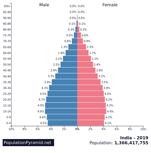
The y-axis represents the age typically in 5 year age groups with the youngest age group represented by the bottom bar and the oldest by the topmost bar. The length of the horizontal bar represents the number or percentage of individuals in that age group. Often the years of birth for each age category are also represented on the graph. The age axis is usually truncated at age group 80-85years due to the lower number of individuals in that age group. Population pyramids that are used for the purpose of comparison should be drawn on the same scale with the same age categories.
Related Articles: Types of Population Pyramids, What is Population Explosion?
Related: What is Population Geography, What is Urban Growth
Understanding age-sex pyramids
The shape of the population pyramid communicates significant information about the fertility and mortality of a specific population. Age-sex pyramids are commonly described as young, old, declining, and stationary.
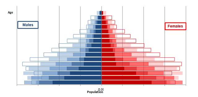
When assessing a population pyramid, many a thing needs into consideration such as the central tendency, mean, median and mode as the data is not absolutely accurate. The average age of a population can be determined using these pyramids. A population with an average age in the 50s or 60s shows an aging population while an average age of 15 or in the early 20s shows a young population with greater potential for growth. A population pyramid can be used to represent additional information about the population in a local region such as the race and ethnicity, marital status and geographic location. In such cases, the bar for the age-sex is subdivided to include the additional categories. The same format is applied consistently throughout the bar diagram on both sides of the Y-axis.
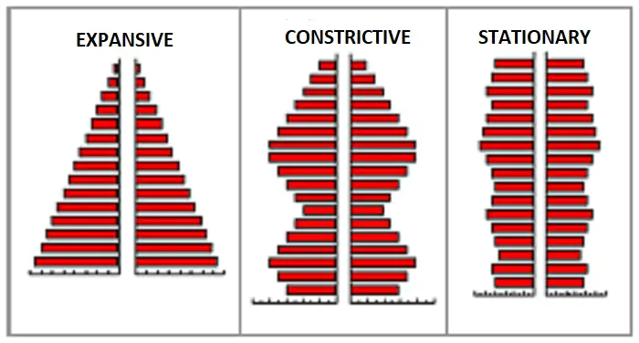
Young and growing structure: Also known as an expansive pyramid, this structure has a typical ‘pyramid’ shape, with a broad base indicating a high birth rate. This structure specifies a significant population undergoing rapid growth.
Old and declining structure: Also known as the constrictive pyramid, this pyramid has a top-heavy structure that indicates a high population of older age groups which signifies a high dependent population. This may result from low birth rates and low death rates.
Stationary pyramid: A population pyramid with a rectangular population pyramid indicates a population that is neither growing nor declining. There are similar proportions in each age group, apart from at the oldest ages (due to mortality).
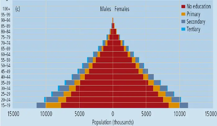
The age-sex pyramid can also be used to represent additional categories of a population, such as marital status, education, or geographic location. In this case, the bar for each age-sex group is further subdivided to represent the additional categories. The formatting system used to depict the additional categories should be applied consistently throughout the graph.
Other information which helps with interpretation
The Population Pyramid is usually represented through the following procedure. The shape of the bar diagram gives enough information about the age group and the sex of a specific population. The broad base of the pyramid indicates a large number of younger populations in the region as compared to the tapering top which indicates the relatively lower proportion of the older age group.
It is not necessary that the two sides of the Y-axis will be equal. The number of males and females in a population vary considerably in a region. For example, the number of females in the older age group is frequently larger than the males in the same age group. This is reflected in the shape of the pyramid with the bars on the right side of the Y-axis being longer than those on the left for the specific age groups.
The median age group of the population is the bar on mid of the Y-axis that equally divides the bar graph into equal halves within the pyramid (above and below).
The Population pyramid is good to represent the fertility and mortality in a region. It is easily reflected in the shape of the pyramid. A broad base and sharply tapering sides indicate a high rate of mortality as well as fertility in the lower age groups. Any unusual rate like high fertility or high mortality in any of the age groups is indicated by a bulge or an indentation on the pyramid. These aberrations can be caused due to migration in the region.
Population pyramids and demographic transition
According to demographers who study the historical changes in the age and gender variation along with the study of the fertility and mortality of the population, the transition of the demography can be represented by population pyramids. The stages of the transition can be indicated by population pyramids wherein the shape of which gives useful information on the demography.
The “Demographic Transition” is a model that defines population change over time. This theory is based on an understanding of the observed transitions, in birth and death rates in industrialized societies over the past two hundred years or so by the American demographer Warren Thompson in 1929. The Demographic transition theory suggests that future population growth will develop along with a predictable four-stage model:
Stage 1: birth and death rates are all high, while life expectancy is short. As countries begin to industrialize, they enter
Stage 2: where birth-rates are higher while infant mortality and the death rates drop. Life expectancy slightly increases.
Stage 3: occurs once a society is thoroughly industrialized; birth-rates decline, while life expectancy continues to increase. Death rates continue to decrease. In the final phase
Stage 4: we see the post-industrial era of society. Birth and death rates are low, people are healthier and live longer, and society enters a phase of population stability. The overall population may even decline.
The stages of this transition are represented in detail by different population pyramids:
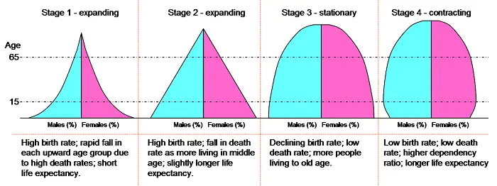
A pyramid with a broad base and sharply tapering sides reflect high fertility and high mortality rates in the younger age groups which results in a population that increases very gradually and remains relatively low. This is followed by a pyramid that reflects a dip in the mortality rates in the younger age groups along with a high fertility rate. There is a rapid growth in the population which however remains relatively young. The third stage in the transition of the demography is represented by a pyramid that has almost vertical sides with a broad base and peak. This would indicate a low fertility and mortality rates. A considerable section of the population comprises of older people as compared to the previous two stages and the population reflects noticeable stability.
Conclusion
Population pyramid or age-sex pyramid is a handy tool, ideal for detecting changes or differences in population patterns across nations or selected population groups and speculate a population’s future development. These pyramids are regularly generated and referred to in fields such as Planning, Ecology, Sociology, and Economics.
Also Read: Standardization of rates in Demography, What is Population Dynamics
Author Bio: This article was written by P. Soujanya with inputs from Planning Tank editorial team. P. Soujanya is a member of NOSPlan and a student at Jawaharlal Nehru Architecture and Fine Arts University.
References
- Poston, D. L., Jr. (2005). Age and Sex. Handbooks of Sociology and Social Research, 19–58. https://link.springer.com/chapter/10.1007/0-387-23106-4_2?error=cookies_not_supported&code=6e52400e-3e40-4956-a0fb-5a149f973769.
- Poston DL, Bouvier LF. 2017. Population and Society: An Introduction to Demography. New York: Cambridge University Press. 2nd edition. Chapter 10 (pp. 266–311).
- Sloggett A (2015). Population Analysis for Policy and Programmes. Paris: International Union for the Scientific Study of Population. Available at https://papp.iussp.org/sessions/papp101_s02/PAPP101_s02_040_010.html.
- Bezy, J. M. (2016, April 7). Population pyramid | sociology. Retrieved from https://www.britannica.com/topic/population-pyramid.
- Figure 1 source: populationpyramid.net
- Figure 2 source:
- Figure 3 source: Lutz, Wolfgang & Sanderson, Warren & Scherbov, Sergei. (2020). Demographic and Human-Capital Trends in Eastern Europe and Sub-Saharan Africa.
- Figure 4 source: https://commons.wikimedia.org/wiki/File:Dtm_pyramids.png